A Citation Network of Wikipedia’s Featured Articles

Type an unfamiliar term into Google, and chances are your quest for answers will cross paths with Wikipedia. With more than 470 million unique monthly visitors as of February 2012, the world’s free encyclopedia has become a popular source of information. Our team (Jackie Cohen, Priya Kumar, and Florence Lee) used network principles to explore where Wikipedia gets its information.

Our analysis suggests that Wikipedia’s best articles cite similar sources. Why is this important? Information about the most frequently cited domains may give Wikipedia editors a good starting point to improve articles that need additional references.

We reviewed the citation network of Wikipedia’s English-language featured articles to discover which categories of articles shared similar citation sources, or domains. Wikipedia organizes its more than 4,200 featured articles into 44 categories; we found that every pair of categories shares at least one domain, creating a completely connected network.

In the network graph (Figure 1), each category is a node. If two categories share at least one domain, an edge appears between them. Since every category pair shares at least one domain, each node shares an edge to every other node. The graph has 44 nodes and 946 edges.

Figure 1: Citation Network of English-Language Wikipedia Featured Articles

network_graph

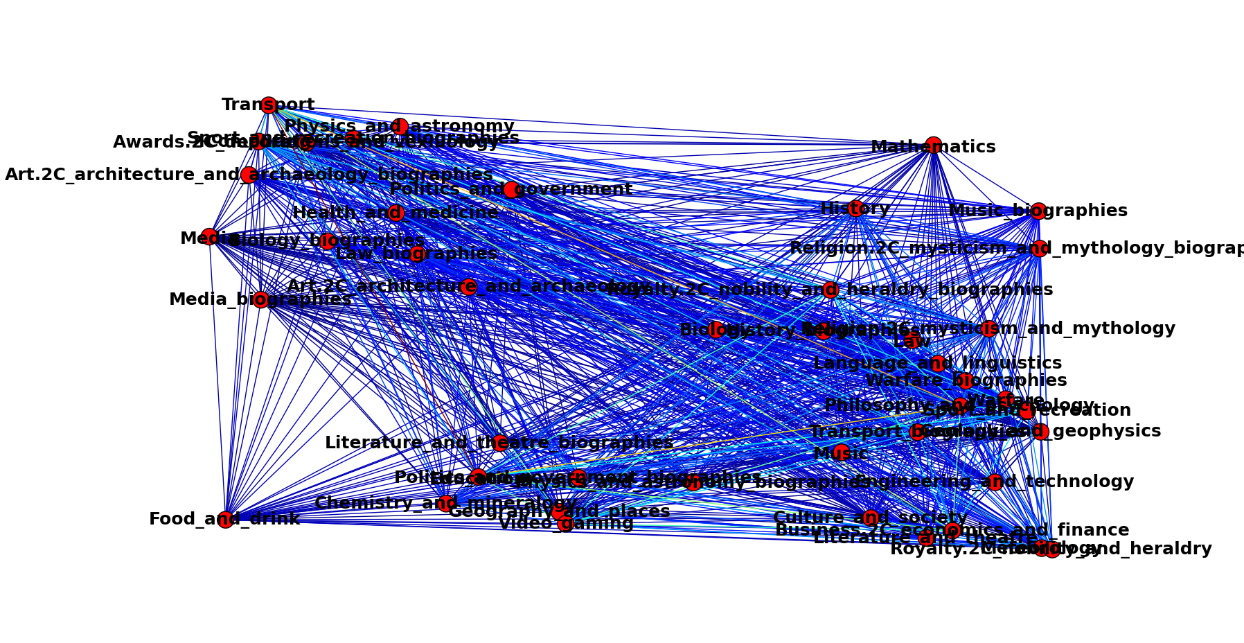
But the mere existence of an edge doesn’t tell us about the strength of the relationship, or the number of shared domains, between two categories. The two categories could share one domain or hundreds. We assigned weights to the edges to determine which pairs share more domains than others.

First, we determined how many shared domains existed in the entire network. If a domain appeared in articles of at least two categories, we considered it a shared domain. For example, at least one Wikipedia article in the biology category cited an nytimes.com link, and at least one Wikipedia article in the law category also cited an nytimes.com link. So we added nytimes.com to the list of shared domains. Overall, we found 1,103 shared domains in the network.

We calculated edge weights by dividing the number of shared domains between a category pair by the total number of shared domains in the network. For example, biology and law shared 14 domains, so the pair’s edge weight was 0.0127 (14 divided by 1,103).

The distribution of edge weights appears to be a power law distribution (Figure 2). But graphing the distribution on a log-log scale (Figure 3) shows a curved line. Despite the linear distribution’s long tail, it doesn’t appear to be a true power law distribution.

Figure 2: Edge Weight Distribution – Linear Scale      Figure 3: Edge Weight Distribution – Log-Log Scale

linear                  log-log

We scaled the edges on an RGB spectrum. The vast majority of category pairs cite fewer than five percent of the shared domains, which is why thick cables of blue traverse the network graph in Figure 1. The occasional turquoise edges represent the pairs that cite more than five percent of shared domains.

The pairs that share the most domains are:

  1. Politics and Government Biographies &  Religion, Mysticism, and Mythology (223 shared domains; 0.2022 edge weight)
  2. Physics and Astronomy & Physics and Astronomy Biographies (159 shared domains; 0.1442 edge weight)
  3. Physics and Astronomy & Religion, Mysticism, and Mythology (150 shared domains; 0.1360 edge weight)

The second pair feels intuitive. We scratched our heads at the first pair and found the third pair interesting, given that the two categories often appear on different sides of various public debates. Some of the shared domains between this pair, such as slate.com, jstor.org, and christianitytoday.com, were unsurprising, but we did notice several unexpected shared domains in this pair, including brooklynvegan.com and vulture.com.

Figure 2 depicts an elbow around the edge weight of 4.6 percent. If we use this as a threshold to create the network, that is, only draw an edge if its weight is higher than 0.046, the network becomes far less connected (Figure 4).

Figure 4: Citation Network with an Edge Weight Threshold of 4.6 Percent

threshold

We also examined the domains themselves. The three most popular shared domains were:

The widespread citation of these domains aligns with Wikipedia’s encyclopedic nature; these sites are gateways into vast swaths of digitally recorded information and knowledge.

Considering the least popular domains, 601 domains were only shared between one category pair. Removing those domains from the graph only deleted four edges, since most category pairs share more than one domain. This suggests that edge weight is a better threshold for examining the relationships in this network than domain distribution.

While typical network characteristics such as centrality measures, community structures, or diffusion were not relevant in the completely connected network, examining edge weights yielded interesting findings. Future work could examine network characteristics of the thresholded graph as well as consider whether patterns exist in the way various category pairs cite different domain types (e.g., journalism, scholarly, personal blogs, etc).

Project Code: Available here

The project can be replicated by running: grab_data.py, manage_data.py, data_counts.py. The first two files collect and parse the data we describe above. The data_counts.py file contains all the network manipulation, and, if you download the entire repository, can be run immediately (the repository includes the results from the former two files). This last file contains comments that explain where in the code we determined different network metrics and examined aspects of our network. This includes where we implemented edge weight thresholding (Figure 1, Figure 4) and where we conducted Pythonic investigations into whether the edge weight distribution was a power law distribution.

Advertisement

Data Storytelling: A Definition?

Data storytelling and storytelling with data: is there a difference? A fellow conference attendee posed this question to me during last month’s Tapestry Conference in Annapolis. After thinking for a moment, I responded that for me, the difference lay in the process.

I envision data storytelling as when you’re looking at data and want to know, “What is this data trying to tell me?” Storytelling with data for me is where you have a story in mind and seek data to substantiate it. Data storytelling feels more quantitative; I imagine needing to collect, clean, manipulate, and analyze the data before crafting the story. Storytelling with data, however, feels more fluid, with the story and the data coming together concurrently.

I acknowledge this may be complete bunk, and I welcome thoughts and critiques from others. At the end of the day, defining data storytelling may be less important than actually doing it. But after attending the second Tapestry Conference on data storytelling, I’m left itching for a framework, or at least continued conversation. Data storytelling is a beautiful concept, applicable across many domains: journalism, academia, technology development, business, advocacy, public policy. It’s also in its infancy, and defining it might force structure on a realm that needs exploration and freedom.

That doesn’t mean we should avoid descriptions of what constitutes good data storytelling. Journalist and infographics professor Alberto Cairo offered a starting point in his keynote (slides) on visualization for communication as “the insightful art.” Visualization for general audiences, he said, should be:

1. Truthful: Present your best understanding of the truth.
2. Functional: Choose perceptual elements (e.g., color, font) that help your audience understand what you want to convey.
3. Beautiful: Please the senses of your reader.
4. Insightful: Help your reader understand the main point; explain what is surprising, relevant, or interesting about the data.
5. Enlightening: Change someone’s mind for the better.

Personally, I would put “beautiful” last, not because it’s unimportant, but because for me, conveying information comprises the core of data storytelling.

Cairo encouraged us to be evidence-driven communicators, not activists. This is 100 percent true for journalists. However, activists who want to tell their story should feel welcome to adopt the principles of data storytelling. I agree that infographics should not massage data or mislead readers. But, as my aforementioned definition suggests, it’s possible for the story to precede the data.

Jock Mackinlay, researcher and Tableau Software VP, offered one check against misguided data storytelling: provide raw data with visualizations. Doing so can hook readers into your visualization, letting them explore it for themselves. It also validates the author and can promote conversation, enabling others to carry analysis further.

The importance of data literacy underpinned both presentations. Readers are going to see infographics from journalists and marketers, and they need to know how to differentiate them. Raw data provides the audience with a powerful tool, but only if the audience itself feels capable and empowered to take that data and run with it. Plenty of people do feel this way, and I hope that future Tapestry conferences will help us think of ways to build data literacy in our schools and workplaces so that even more people do.

Stay tuned for more Tapestry Conference posts.

Data Storytelling in Novel Form

If information schools had a first book program, I’ve found their next selection: Mr. Penumbra’s 24-Hour Bookstore. The novel includes something for all information professionals: dusty books, Google’s book scanner, typefaces, time series visualizations, Ruby, dial-up Internet, Hadoop, Turkers, and an epic quest.

Upon completing my own epic semester of coding, event planning, and thesis research, I longed to lose myself in a story. I don’t read much fiction nowadays and didn’t care for an automated Amazon recommendation, so a few weeks ago I wandered into Ann Arbor’s newest bookstore, Literati, in search of human guidance.

The handwritten note did me in. Folded white papers scattered about the shelves and among the tabletop piles of books offered suggestions from the bookstore staff. Handwritten suggestions. Scrawled in pen, a refreshing reminder that these recommendations came from people who read the books and took the time to explain why they were worth your eyes.

The one tucked into the stack of “Mr Penumbra’s” said something along the lines of, If you like Google, you’ll like this book. “Well,” I thought, “I’m studying what Google does, is, and means in today’s society, so sure, I’ll pick this one up.” Ever the nerd, even in leisure.

The story centers on Clay Jannon, a recently unemployed art school graduate who lives in San Francisco and happens upon a bookstore in need of a clerk. But the bookstore loans more books than it sells, and the books it loans contain symbols, not words. Thus begins the epic quest, which at its climax includes the line, “We need James Bond with a library science degree,” (What iSchool reading group wouldn’t swoon over a book saying that?)

The story extends beyond the book; it includes an accompanying ebook “short” and a Twitter account. The physical book even glows in the dark (which is quite a novelty when you’re half-asleep and halfway through finals). So, take your mind off the cold (it’s -15 degrees F outside as I write this), wander into the world of Mr. Penumbra, and enjoy this technology-fueled homage to the printed word.

P.S. If anyone at UMSI is reading this, the author Robin Sloan is a Michigan native. We are meant to have a connection with this book…

Keep Your Sanity While Learning to Code

Learn to code? The question populated headlines this year. The Atlantic‘s Olga Khazan set journalists a-Twitter after pronouncing that journalism schools should not require students to “learn code.” She insisted her opposition extended to HTML and CSS, not data journalism, data analysis, or data visualization, making her post’s headline feel misleading given that those can require learning code.

Sean Mussenden of the American Journalism Review concisely expressed what I thought when reading Khazan’s piece. I fact-checked AJR articles in college, and tricking my brain to think I was fact-checking is the only thing that saved me from hurling a rock at my laptop while coding.

Four months ago I was a coding newbie. My crowning achievement was a Python script that determined whether a given string of text was of Tweet-able length. By December, I had cleaned and manipulated datasets in Python, created heat maps and scree plots in R, designed map visualizations in D3, and analyzed my Facebook and Twitter data. I needed the structure and graded homework assignments that graduate school courses in data manipulation, exploratory data analysis, and information visualization offered, but I wouldn’t have survived those classes without the wealth of resources on the Interwebz. These lessons I absorbed may help you meet your code-learning resolutions.

1. Find a tutorial that works for you

Free online tutorials abound. Shop around, take what works, and leave what doesn’t. I’m not suggesting giving up at the first sign of difficulty. Coding is hard, frustrating, tedious, and time-consuming. But it won’t always be. Rewards, even just the personal satisfaction of overcoming challenges, await those patient enough to try. Sink your time into a tutorial that fits your learning style and avoid wasting time on one that doesn’t. Last January I enrolled in a Coursera class on data analysis in R. The description said a programming background was helpful but not required. A week into the course, it was clear: a programming background was definitely required. I couldn’t afford to spend 10 hours on assignments I didn’t understand, so I stopped.

This September, I needed a crash course on Python. I had one week to complete a homework assignment that incorporated everything I learned in a year of basic coding courses. My lifesaver: Learn Python the Hard Way. Just like learning to write the alphabet by tracing over letters, this tutorial teaches the logic of coding by having you type code that’s in front of you. Another assignment required programming in D3, but I had no knowledge of JavaScript. Scott Murray’s D3 tutorials on Aligned Left and his O’Reilly book (which comes with sample files) were a life raft.

2. Google is your friend

Tutorials won’t give you all the information you need, but Google can help. Paste your error message into the search bar to get a sense of what went wrong. Or, (and I found this more effective), type what you’re trying to accomplish. Even the craziest phrase (“after splitting elements in lines in python, keep elements together in for loop”) will get you somewhere. People often share snippets of code on forums like Stack Overflow. Test their code on your machine and see what happens. Debugging is a random walk, requiring you to chase links and try several strategies before that glorious moment when the code finally listens to you. Don’t worry. You’re learning even when you’re doing it wrong.

3. But people are your best friend

I tweeted my frustration with the Coursera class last January. To my surprise, digital storyteller Amanda Hickman responded to my tweets and set up a Tumblr to walk me through the basics of R Studio. People want to help, and their help will get you through the frustration of learning to code. This semester I saw the graduate student instructor nearly every week during office hours, bringing him the specific or conceptual questions that tutorials and Google couldn’t explain me. When you get stuck, reach out. Ask that cousin who works in IT to help you debug something. Post on social media that you’re looking for help. Use Meetup to find fellow coders with whom you can meet face-to-face. Find groups like PyLadies (for Python) and go to their meetings. Don’t let impostor syndrome, or the feeling that you’re not really a “coder” stop you. You are a coder.

4. Take breaks

My first coding professor said, “Don’t spend hours on a coding problem. Take a break and return when your mind is fresh.” LISTEN TO HIM. More than once, I sunk six or seven hours trying to debug code, only to collapse into bed and then solve the problem within an hour the next morning. When coding threatens to consume your life (or unleash dormant violent tendencies),  say, “Eff this for now” and take a well-deserved break.

Happy coding!

Google Glass: Not Scary, Worth Discussing

Instantaneous photographs…have invaded the sacred precincts of private and domestic life; and numerous mechanical devices threaten to make good the prediction that ‘what is whispered in the closet shall be proclaimed from the house-tops.’

Such is our fear of Google Glass, right? Taking pictures everywhere, sharing information with everyone, no more keeping secrets. But the above quote predates Glass by 123 years. Samuel Warren and Louis Brandeis penned these words shortly after the Kodak camera arrived.

I tried Glass yesterday, and I give Google one thing: Glass isn’t scary (yet). Users can’t do anything with Google Glass they can’t already do with a smartphone. Google Glass just lets people do some of the same things hands-free. A tap to the device’s right arm activates Glass. A small display appears above the right eye, not in the line of sight. It shows the time and the activation command, “OK Glass.” Speak these magic words and a menu with four options appears: Google, take a picture, look up directions, and record a video. I used the device on a guest account, so I couldn’t send emails/text messages or post information to social networks.

I’m impressed with the technology. Voice recognition could use some work, but a Google staffer said you hear the device not from airwaves entering your ear, but vibrations entering your skull. I wouldn’t buy Glass because I see no need for it. It’s meant to let you live life assured that you won’t miss anything important, but I’ve no need for that much convenience or connection.

Regardless, I hope the paranoia around it continues. Not because Glass is bad, but because seeing a camera on someone else’s face reminds us the default settings of information in society have shifted. This isn’t new (see above quote), but the pace at which technology has advanced means we can do a lot more with the information we collect. How do we as a society feel about that? Google Glass can’t post a running first-person video feed of your life to the Web (yet). But that which we fear already exists. Someone might record video of you and post it online without you realizing. Local governments have set up security cameras in parks. And the police use facial recognition software to mine enormous databases of images. So, let’s keep voicing our concern over recording and sharing photos and videos. Just don’t pretend it’s all Glass’s fault.

The Value of Social Network Sites

I became a curmudgeon way before my time. For about five years, I rode the social media skepticism wagon. I had Facebook and Twitter accounts but used them sparsely. My concern stemmed from the privacy implications of posting so much information about ourselves online. I also felt web-mediated communication took people away from lively, meandering face-to-face or telephone conversations, away from the world around them. Arab media researcher Donatella Della Ratta captured this anti-screen sentiment in a different context — crisis reporting via social media.

“If we can document and verify things remotely, only using social media, like Andy [Carvin] and Eliot [Higgins] do, well then why spending [sic] so many years and hours and hours of hard study to understand a language, a culture?”

Della Ratta has a point. Staring at a screen cannot replace living a life. But we cannot discount the value that social network sites bring to our lives. Last fall I began using Twitter more often. The more I used it, the more I gained. I got to know people I’d briefly spoken to in person. I interacted with new people. If nothing else, logging on guaranteed me a few interesting articles to read.

From Cliff Lampe’s e-Communities course, I learned about the deep human need that online connection fulfills. I realized that online communication sometimes offers greater benefit than face-to-face communication. Between readings, lectures, and analysis of various online communities, I gained respect for social network sites.

A recent conversation at work cemented my belief in the value of online interaction, and it involved the same Donatella Della Ratta. She spoke to a group of interns and staff about her current research on the role of memes in the Syrian conflict. Fellow intern Leigh Graham related what Della Ratta saw in Syria to her own fieldwork and Saudi Arabia. As they exchanged thoughts, this hit me: I live in a place where I’m free to go wherever I want, talk to whomever I want, and say whatever I want. I can wake up at 4 a.m., meet a friend at 7-11, and chat over slurpees. I wouldn’t, but I can. This isn’t always the case in other parts of the world.

When people cannot gather publicly because war ravages the public space around them or their government outright forbids it, they turn to the Web. Young people in Gaza are tech-savvy because they have nothing else to do with their time, Della Ratta said. Saudi Arabians share more information online than anyone else in the world, which makes sense given the country’s 13 million women live with their independence severely constrained, Graham explained. Sites such as Facebook allow people to communicate with others without leaving the house.

As the Prism news reminds us, sites such as Facebook also operate under the laws of the United States. This plus the fact that online communication means so much to so many people underscores our need for a national, public debate about how other people, whether government officials or corporate vice presidents, use our data. As Rebecca MacKinnon wrote in “Consent of the Networked,” what people in charge believe matters:

“Critics are concerned that Facebook’s core ideology — that all people should be transparent and public about their online identity and social relationships — is the product of a corporate culture based on the life experiences of relatively sheltered and affluent Americans who may be well intentioned but have never experienced genuine social, political, religious, or sexual vulnerability.”

Practically speaking, we can’t abandon the Internet. We as citizens must talk about about how much power over our data we want to give the government or private companies. The answer to these questions isn’t get off Facebook or stop sending email. As I realized this year and during this conversation, we cannot ignore the tremendous benefits that connection on social network sites offers.

Summer Plans: Researching Online Freedom of Expression

Though my email address ends with @umich.edu, all correspondence flows through a Gmail inbox. My appointments are on a Google Calendar, and my fellow students and I routinely use Google Docs to keep track of group project information. The university and Google partnered in October, 2011.

I like Google products. Gmail is the best email client I’ve used, Google Calendar is what pried me away from paper planners, and I’m drafting this post in Google Docs. In exchange for free access to its products, Google can mine all the content I give it. This unsettles me, but I also have no other choice, at least when it comes to my university-related communication technology needs.

I bring up Google not to debate the advantages and disadvantages of its agreement with the university, but to illustrate a point Rebecca MacKinnon articulates in her book, Consent of the Networked:

“Internet-related companies are even more powerful because not only do they create and sell products, but they also provide and shape the digital spaces upon which citizens increasingly depend (p. 11)…The lives of people around the world…are increasingly shaped by programmers, engineers, and corporate executives for whom nobody ever voted and who are not accountable to the public interest in any way (p. xxii).”

While the United States is by no means innocent of pressuring companies and shaping laws that limit its citizens’ freedom online, I write this, send email, post on Facebook, and Tweet without fear that someone will persecute me for what I say. For this I am immensely grateful. MacKinnon writes of the Russian secret service obtaining financial records of those who donated money to a political blogger, the Chinese government forcing tech company employees to divulge personal information, including emails, of users, and the Iranian regime torturing people for their Gmail and Facebook passwords.

Internet companies collect and retain giant amounts of data about us. They can mine it,  governments can force companies to share it, and black hat hackers can decide they want a look, too. As I write this, the Washington Post’s homepage includes an article about a Chinese hack into Google’s database of accounts the FBI flagged for surveillance. These stories are as much a part of data storytelling as combing through databases and developing apps. As I wrote in my post about policy, “Understanding what organizations do with data is as important as using data to present compelling stories.”

This summer, I will join the Berkman Center for Internet & Society as an intern. I will work on its suite of projects related to freedom of expression: Internet Monitor, Internet Robustness, and Herdict. Over the next few months, I hope my work will contribute, in some small way, to answering MacKinnon’s central question: “How do we make sure that people with power over our digital lives will not abuse that power” (p. xx).

What are the most critical Internet freedom issues you see in today’s society? Share them in the comments.

Telling Data Stories at Tapestry

What do journalists, surgery center developers, professors, small business owners, and researchers share in common? All take in a lot of data and must translate and present that information to others in a compelling manner. Also, all of them attended Tapestry, the inaugural conference on data storytelling. The event offered a valuable opportunity to connect with all sorts of people who seek to shape this nascent field of data storytelling.

Wish you were there? Check out this Storify I created and learn more: http://storify.com/PriyaKumar/tapestry.

Diving into Data: How to Jumpstart Data Analysis in Media Organizations

Take dozens of smart people, given them a ton of information, and demand they make sense out of it under deadline pressure. Journalists know this as life in a newsroom, and they see great work emerge from such an environment every day. The same concept works for service in the age of data, as I witnessed at last weekend’s A2 DataDive.

Students and local residents gathered on the University of Michigan’s campus for two days to crunch data, give back to local nonprofits, and learn a thing or two. Hackathon events such as these offer a model through which media organizations can expand their data journalism efforts and leverage local expertise.

One section of the Data Journalism Handbook describes how a Danish news organization used a hackathon to help journalists and web developers understand each others’ worldviews. Laura Rabaino offers a how-to guide on how to organize a newsroom hackathon after her experience with one at the Seattle Times.

The DataDive is a hackathon with a public service twist. For months before the actual event, the organizers (of which I am one), worked with four local nonprofit organizations to determine what data they had and what they hoped to do with it. At the event, each nonprofit gave a brief presentation that outlined their mission, their data, and their questions.

Then, we let people loose. Anyone who was interested could participate. Volunteers worked all day Saturday and during the morning on Sunday to analyze and visualize the data. On Sunday afternoon, each team presented their findings.

The most heartening and motivating element of the entire experience was seeing just how excited people get.
“I love this stuff,” volunteer Alex Janke remarked while in the middle of a statistical analysis. “I wish I could do this every weekend.”

The sensation of using your skills and hobbies to help another person out is powerful, and it’s why I think the DataDive model is well-suited for media organizations. Similar to nonprofits, many media outlets operate based on a mission of public service. (If your organization is a nonprofit, you can be part of a DataDive in your area. Check out DataKind for more information.) A journalistic DataDive would give non-journos a peek behind masthead and give the news organization a chance to engage with the community.

Of course, watch out for challenges:

  • Be aware of potential culture clash. (See: Obama campaign vs. open-source coders) At the DataDive, we make all of our materials open to the public.
  • Provide volunteers with enough guidance on what you hope to accomplish with the data, but don’t stifle the creativity that makes this event so valuable.
  • Make sure everyone writes down how they’re doing what they’re doing while they’re doing it. You want to be able to replicate (or at least understand) what happened.
  • Finally, don’t run out of coffee!

What questions do you have about the DataDive? Leave a note in the comments.